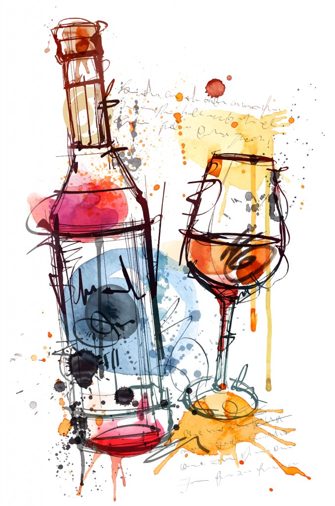
The Art of Wine Label Design
Imagine you’re walking through the wine aisle of your favorite grocery or liquor store. Today you’re searching for a white wine to bring home and enjoy with dinner. You walk past bottles and bottles, but suddenly come to a halt, as something has caught your eye. It wasn’t the varietal or bottle shape that made you stop your search, but the creative label wrapped around the wine. You grab the bottle and go, “That was easier than I thought.”
Producers have began utilizing graphic artists to create unique wine label designs that stand out to the consumer and push the point of sale. Many people find it difficult to describe what kind of wine they like, but when shown options with labels, can choose instantly. So the question is, how can your restaurant start taking advantage of aesthetically appealing labels?
A wine label acts as a sales tool. It makes wine more desirable, whether the quality is there or not. Artists and designers have paired with vineyards to create labels that reflect the brand and draw consumers to the wine over the competition. Wine-makers have recognized that consumers, especially Millennials, judge a wine based off of the label that it adorns. Labels can be fun with quirky design work, or give off a classy message with a few words in a regal font. Either way, wine labels seem to be an essential point of focus during the consumer’s decision-making process.
There are several factors wine-producers must consider when dressing a bottle of wine. If it is a cheaper wine, a loud label can take away from the lower price point that typically makes the sale. Some people might ignore the wine with a fancier label, assuming that it is more costly. However, a simple label can also work for an expensive wine. If this is the case, other aspects of the label, like paper quality, will have to be higher. Expensive wine labels have to go the extra mile to reflect that their wine is superior to the rest.
Its also beneficial for producers to think about including a color that people will consistently associate with their wine. This has been done with other beverages, like Coca-Cola, who has trademarked the red that appears on each bottle and throughout their brand. Seeing a similar color on other products will prompt consumers to think of a specific brand and return to purchasing such wine. Having a color that repeats throughout the design work will make the brand appear more uniform and memorable.
In a restaurant setting, it is more difficult for people to imagine what they are getting from a basic paper menu that lists wine after wine. Even with some information given, such as the vintage and producer, people aren’t sure what to expect when ordering from the list, causing some to skip purchasing a beverage all together. Uncorkd’s digital menus let restaurants include the information from their classic wine list, tasting notes and a picture of the wine label. Sales increase an average of three times when people are able to see what the wine looks like before buying a beverage to accompany their meal. The picture of the label helps people identify what wines they have had in the past and to remember that specific wine for the next time they visit your establishment. A beautifully made label shown on your menu could be the difference between a customer purchasing a cheap or expensive wine, a glass or a bottle.
- Sommelier Surge in Restaurants - August 7, 2015
- 3 Up-and-Coming Restaurant Industry Trends - August 6, 2015
- Millennial’s Impact on the Wine Industry - August 4, 2015

